


CircularGauge QML Type▲
-
Import Statement: import QtQuick.Extras 1.4
-
Since: Qt 5.5
-
Inherits: FocusScope
-
Group: CircularGauge is part of extras, extras-non-interactive
Detailed Description▲
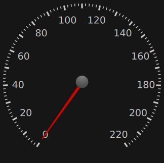
The https:// is similar to traditional mechanical gauges that use a needle to display a value from some input, such as the speed of a vehicle or air pressure, for example.
The minimum and maximum values displayable by the gauge can be set with the https:// and https:// properties. The angle at which these values are displayed can be set with the https:// and https:// properties of https://.
Example:
CircularGauge {
    value: accelerating ? maximumValue : 0
    anchors.centerIn: parent

    property bool accelerating: false

    Keys.onSpacePressed: accelerating = true
    Keys.onReleased: {
        if (event.key === Qt.Key_Space) {
            accelerating = false;
            event.accepted = true;
        }
    }

    Component.onCompleted: forceActiveFocus()

    Behavior on value {
        NumberAnimation {
            duration: 1000
        }
    }
}
You can create a custom appearance for a https:// by assigning a https://.
Property Documentation▲
maximumValue : real▲
This property holds the largest value displayed by the gauge.
minimumValue : real▲
This property holds the smallest value displayed by the gauge.
stepSize : real▲
This property holds the size of the value increments that the needle displays.
For example, when stepSize is 10 and value is 0, adding 5 to https:// will have no visible effect on the needle, although https:// will still be incremented. Adding an extra 5 to https:// will then cause the needle to point to 10.
style : Component▲
tickmarksVisible : bool▲
This property determines whether or not the gauge displays tickmarks, minor tickmarks, and labels.
For more fine-grained control over what is displayed, the following style components of https:// can be used:
-
https://
-
https://
-
https://
value : alias▲
This property holds the current value displayed by the gauge, which will always be between https:// and https://, inclusive.