


ToggleButton QML Type▲
-
Import Statement: import QtQuick.Extras 1.4
-
Since: Qt 5.5
-
Inherits: Button
-
Group: ToggleButton is part of extras, extras-interactive
Detailed Description▲
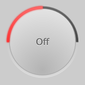
An unchecked https://.
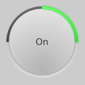
A checked https://.
The https:// is a simple extension of Qt Quick Controls' Button, using the checked property to toggle between two states: checked and unchecked. It enhances the visibility of a checkable button's state by placing color-coded indicators around the button.
You can create a custom appearance for a https:// by assigning a https://.
Property Documentation▲
action : Action▲
This property holds the associated button action.
If a button has an action associated, the action defines the button's properties like checked, text, tooltip etc.
When an action is set, it's still possible to override the https://, https://, https://, and https:// properties.
The default value is null.
activeFocusOnPress : bool▲
This property specifies whether the button should gain active focus when pressed.
The default value is false.
checkable : bool▲
This property holds whether the button is checkable.
The default value is false.
checked : bool▲
This property holds whether the button is checked.
Only checkable buttons can be checked.
The default value is false.
exclusiveGroup : ExclusiveGroup▲
This property holds the https:// that the button belongs to.
The default value is null.
[read-only] hovered : bool▲
This property indicates whether the control is being hovered.
iconName : string▲
The image label source as theme name. When an icon from the platform icon theme is found, this takes precedence over https://.
This property requires https://.
iconSource : url▲
This property holds the icon shown on the button. If the button has no icon, the https:// property will be an empty string.
The default value is the empty string.
[read-only] pressed : bool▲
This property holds whether the button is being pressed.
style : Component▲
text : string▲
This property holds the text shown on the button. If the button has no text, the https:// property will be an empty string.
The default value is the empty string.
tooltip : string▲
This property holds the button tooltip.
Signal Documentation▲
clicked()▲
This signal is emitted when the button is clicked.
The corresponding handler is onClicked.