


Tumbler QML Type▲
-
Import Statement: import QtQuick.Extras 1.4
-
Since: Qt 5.5
-
Inherits: FocusScope
-
Group: Tumbler is part of extras, extras-interactive
Detailed Description▲
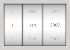
Tumbler requires Qt 5.5.0 or later.
The Tumbler control is used with one or more https:// items, which define the content of each column:
Tumbler {
    TumblerColumn {
        model: 5
    }
    TumblerColumn {
        model: [0, 1, 2, 3, 4]
    }
    TumblerColumn {
        model: ["A", "B", "C", "D", "E"]
    }
}
You can also use a traditional model with roles:
Rectangle {
    width: 220
    height: 350
    color: "#494d53"

    ListModel {
        id: listModel

        ListElement {
            foo: "A"
            bar: "B"
            baz: "C"
        }
        ListElement {
            foo: "A"
            bar: "B"
            baz: "C"
        }
        ListElement {
            foo: "A"
            bar: "B"
            baz: "C"
        }
    }

    Tumbler {
        anchors.centerIn: parent

        TumblerColumn {
            model: listModel
            role: "foo"
        }
        TumblerColumn {
            model: listModel
            role: "bar"
        }
        TumblerColumn {
            model: listModel
            role: "baz"
        }
    }
}Limitations▲
For technical reasons, the model count must be equal to or greater than https:// plus one. The https:// must also be an odd number.
You can create a custom appearance for a Tumbler by assigning a https://. To style individual columns, use the https:// and https:// properties of https://.
Property Documentation▲
Method Documentation▲
TumblerColumn addColumn(TumblerColumn column)▲
Adds a column and returns the added column.
The column argument can be an instance of https://, or a https://. The component has to contain a https://. Otherwise null is returned.
int currentIndexAt(int columnIndex)▲
Returns the current index of the column at columnIndex, or null if the index is invalid.
See Also▲
See also https://()
TumblerColumn getColumn(int columnIndex)▲
Returns the column at columnIndex or null if the index is invalid.
TumblerColumn insertColumn(int index, TumblerColumn column)▲
Inserts a column at the given index and returns the inserted column.
The column argument can be an instance of https://, or a https://. The component has to contain a https://. Otherwise, null is returned.
void setCurrentIndexAt(int columnIndex, int itemIndex, int interval)▲
Sets the current index of the column at columnIndex to itemIndex. The animation length can be set with interval, which defaults to 0.
Does nothing if columnIndex or itemIndex are invalid.
See Also▲
See also https://()