


Container Controls▲
Qt Quick Controls offers a selection of container-like controls.
-
ApplicationWindow: Styled top-level window with support for a header and footer.
-
Container: Abstract base type providing functionality common to containers.
-
Frame: Visual frame for a logical group of controls.
-
GroupBox: Visual frame and title for a logical group of controls.
-
HorizontalHeaderView: Provides a horizontal header view to accompany a TableView.
-
Page: Styled page control with support for a header and footer.
-
Pane: Provides a background matching with the application style and theme.
-
ScrollView: Scrollable view.
-
SplitView: Lays out items with a draggable splitter between each item.
-
StackView: Provides a stack-based navigation model.
-
SwipeView: Enables the user to navigate pages by swiping sideways.
-
TabBar: Allows the user to switch between different views or subtasks.
-
ToolBar: Container for context-sensitive controls.
-
VerticalHeaderView: Provides a vertical header view to accompany a TableView.
Each type of container can be used to group a set of controls together. The following sections offer guidelines for choosing the appropriate type of container, depending on the use case.
ApplicationWindow Control▲
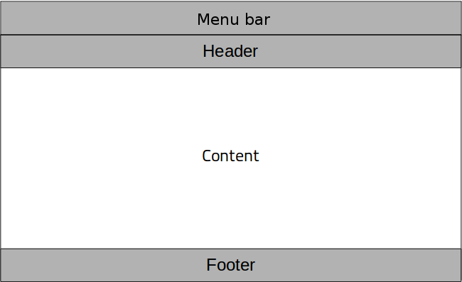
ApplicationWindow creates the root window of an application, and makes it easy to add an optional header and footer to that window.
Frame Control▲
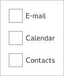
Frame is used to layout a logical group of controls together, within a visual frame.
GroupBox Control▲
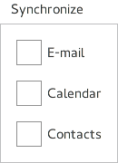
GroupBox is used to layout a logical group of controls together, within a titled visual frame.
Page Control▲

Page provides page-specific header and footer items. It is perfectly possible to use ApplicationWindow for setting the header and the footer, but if you have a header and footer which varies per screen, then it is better to use Page.
Pane Control▲
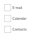
Pane provides a background color that matches with the application style and theme. Pane does not provide a layout of its own, but requires you to position its contents, for instance by using a RowLayout or a ColumnLayout.
ScrollView Control▲

ScrollView provides scrolling for user-defined content.
StackView Control▲

StackView organizes content pages into a stack using a last-in-first-out principle: the last item to be "pushed" onto the stack is the first one to be removed, and the top-most item is always the one that is visible.
SwipeView Control▲

SwipeView organizes content pages into a swipable strip.
TabBar Control▲

TabBar organizes content pages into tabs.
ToolBar Control▲

ToolBar is a container of application-wide and context-sensitive actions and controls.