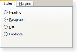
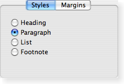
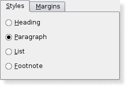
QTabWidget Class ReferenceThe QTabWidget class provides a stack of tabbed widgets. More... #include <QTabWidget>Inherits: QWidget. Public Types
Properties
Public Functions
Reimplemented Public Functions
Public Slots
Signals
Protected Functions
Reimplemented Protected Functions
Additional Inherited Members
Detailed DescriptionThe QTabWidget class provides a stack of tabbed widgets. A tab widget provides a tab bar (see QTabBar) and a "page area" that is used to display pages related to each tab. By default, the tab bar is shown above the page area, but different configurations are available (see TabPosition). Each tab is associated with a different widget (called a page). Only the current page is shown in the page area; all the other pages are hidden. The user can show a different page by clicking on its tab or by pressing its Alt+letter shortcut if it has one. The normal way to use QTabWidget is to do the following:
The position of the tabs is defined by tabPosition, their shape by tabShape. The signal currentChanged() is emitted when the user selects a page. The current page index is available as currentIndex(), the current page widget with currentWidget(). You can retrieve a pointer to a page widget with a given index using widget(), and can find the index position of a widget with indexOf(). Use setCurrentWidget() or setCurrentIndex() to show a particular page. You can change a tab's text and icon using setTabText() or setTabIcon(). A tab and its associated page can be removed with removeTab(). Each tab is either enabled or disabled at any given time (see setTabEnabled()). If a tab is enabled, the tab text is drawn normally and the user can select that tab. If it is disabled, the tab is drawn in a different way and the user cannot select that tab. Note that even if a tab is disabled, the page can still be visible, for example if all of the tabs happen to be disabled. Tab widgets can be a very good way to split up a complex dialog. An alternative is to use a QStackedWidget for which you provide some means of navigating between pages, for example, a QToolBar or a QListWidget. Most of the functionality in QTabWidget is provided by a QTabBar (at the top, providing the tabs) and a QStackedWidget (most of the area, organizing the individual pages).
See also QTabBar, QStackedWidget, QToolBox, and Tab Dialog Example. Member Type Documentation
|
| Constant | Value | Description |
|---|---|---|
| QTabWidget::North | 0 | The tabs are drawn above the pages. |
| QTabWidget::South | 1 | The tabs are drawn below the pages. |
| QTabWidget::West | 2 | The tabs are drawn to the left of the pages. |
| QTabWidget::East | 3 | The tabs are drawn to the right of the pages. |
enum QTabWidget::TabShape
This enum type defines the shape of the tabs:
| Constant | Value | Description |
|---|---|---|
| QTabWidget::Rounded | 0 | The tabs are drawn with a rounded look. This is the default shape. |
| QTabWidget::Triangular | 1 | The tabs are drawn with a triangular look. |
Property Documentation
count : const int
This property holds the number of tabs in the tab bar.
By default, this property contains a value of 0.
Access functions:
| int | count () const |
currentIndex : int
This property holds the index position of the current tab page.
The current index is -1 if there is no current widget.
By default, this property contains a value of -1 because there are initially no tabs in the widget.
Access functions:
| int | currentIndex () const |
| void | setCurrentIndex ( int index ) |
Notifier signal:
| void | currentChanged ( int index ) |
documentMode : bool
This property holds whether or not the tab widget is rendered in a mode suitable for document pages. This is the same as document mode on Mac OS X.
When this property is set the tab widget frame is not rendered. This mode is useful for showing document-type pages where the page covers most of the tab widget area.
This property was introduced in Qt 4.5.
Access functions:
| bool | documentMode () const |
| void | setDocumentMode ( bool set ) |
See also elideMode, QTabBar::documentMode, QTabBar::usesScrollButtons, and QStyle::SH_TabBar_PreferNoArrows.
elideMode : Qt::TextElideMode
This property holds how to elide text in the tab bar.
This property controls how items are elided when there is not enough space to show them for a given tab bar size.
By default the value is style dependant.
This property was introduced in Qt 4.2.
Access functions:
| Qt::TextElideMode | elideMode () const |
| void | setElideMode ( Qt::TextElideMode ) |
See also QTabBar::elideMode, usesScrollButtons, and QStyle::SH_TabBar_ElideMode.
iconSize : QSize
This property holds the size for icons in the tab bar.
The default value is style-dependent. This is the maximum size that the icons will have. Icons are not scaled up if they are of smaller size.
This property was introduced in Qt 4.2.
Access functions:
| QSize | iconSize () const |
| void | setIconSize ( const QSize & size ) |
See also QTabBar::iconSize.
movable : bool
This property holds this property holds whether the user can move the tabs within the tabbar area.
By default, this property is false;
This property was introduced in Qt 4.5.
Access functions:
| bool | isMovable () const |
| void | setMovable ( bool movable ) |
tabPosition : TabPosition
This property holds the position of the tabs in this tab widget.
Possible values for this property are described by the TabPosition enum.
By default, this property is set to North.
Access functions:
| TabPosition | tabPosition () const |
| void | setTabPosition ( TabPosition ) |
See also TabPosition.
tabShape : TabShape
This property holds the shape of the tabs in this tab widget.
Possible values for this property are QTabWidget::Rounded (default) or QTabWidget::Triangular.
Access functions:
| TabShape | tabShape () const |
| void | setTabShape ( TabShape s ) |
See also TabShape.
tabsClosable : bool
This property holds whether close buttons are automatically added to each tab.
This property was introduced in Qt 4.5.
Access functions:
| bool | tabsClosable () const |
| void | setTabsClosable ( bool closeable ) |
See also QTabBar::tabsClosable().
usesScrollButtons : bool
This property holds whether or not a tab bar should use buttons to scroll tabs when it has many tabs.
When there are too many tabs in a tab bar for its size, the tab bar can either choose to expand its size or to add buttons that allow you to scroll through the tabs.
By default the value is style dependant.
This property was introduced in Qt 4.2.
Access functions:
| bool | usesScrollButtons () const |
| void | setUsesScrollButtons ( bool useButtons ) |
See also elideMode, QTabBar::usesScrollButtons, and QStyle::SH_TabBar_PreferNoArrows.
Member Function Documentation
QTabWidget::QTabWidget ( QWidget * parent = 0 )
Constructs a tabbed widget with parent parent.
QTabWidget::~QTabWidget ()
Destroys the tabbed widget.
int QTabWidget::addTab ( QWidget * page, const QString & label )
Adds a tab with the given page and label to the tab widget, and returns the index of the tab in the tab bar.
If the tab's label contains an ampersand, the letter following the ampersand is used as a shortcut for the tab, e.g. if the label is "Bro&wse" then Alt+W becomes a shortcut which will move the focus to this tab.
Note: If you call addTab() after show(), the layout system will try to adjust to the changes in its widgets hierarchy and may cause flicker. To prevent this, you can set the QWidget::updatesEnabled property to false prior to changes; remember to set the property to true when the changes are done, making the widget receive paint events again.
See also insertTab().
int QTabWidget::addTab ( QWidget * page, const QIcon & icon, const QString & label )
This is an overloaded function.
Adds a tab with the given page, icon, and label to the tab widget, and returns the index of the tab in the tab bar.
This function is the same as addTab(), but with an additional icon.
void QTabWidget::changeEvent ( QEvent * ev ) [virtual protected]
Reimplemented from QWidget::changeEvent().
void QTabWidget::clear ()
Removes all the pages, but does not delete them. Calling this function is equivalent to calling removeTab() until the tab widget is empty.
QWidget * QTabWidget::cornerWidget ( Qt::Corner corner = Qt::TopRightCorner ) const
Returns the widget shown in the corner of the tab widget or 0.
See also setCornerWidget().
void QTabWidget::currentChanged ( int index ) [signal]
This signal is emitted whenever the current page index changes. The parameter is the new current page index position, or -1 if there isn't a new one (for example, if there are no widgets in the QTabWidget)
See also currentWidget() and currentIndex.
QWidget * QTabWidget::currentWidget () const
Returns a pointer to the page currently being displayed by the tab dialog. The tab dialog does its best to make sure that this value is never 0 (but if you try hard enough, it can be).
See also currentIndex() and setCurrentWidget().
bool QTabWidget::event ( QEvent * ev ) [virtual protected]
Reimplemented from QObject::event().
int QTabWidget::indexOf ( QWidget * w ) const
Returns the index position of the page occupied by the widget w, or -1 if the widget cannot be found.
void QTabWidget::initStyleOption ( QStyleOptionTabWidgetFrame * option ) const [protected]
Initialize option with the values from this QTabWidget. This method is useful for subclasses when they need a QStyleOptionTabWidgetFrame, but don't want to fill in all the information themselves.
See also QStyleOption::initFrom() and QTabBar::initStyleOption().
int QTabWidget::insertTab ( int index, QWidget * page, const QString & label )
Inserts a tab with the given label and page into the tab widget at the specified index, and returns the index of the inserted tab in the tab bar.
The label is displayed in the tab and may vary in appearance depending on the configuration of the tab widget.
If the tab's label contains an ampersand, the letter following the ampersand is used as a shortcut for the tab, e.g. if the label is "Bro&wse" then Alt+W becomes a shortcut which will move the focus to this tab.
If index is out of range, the tab is simply appended. Otherwise it is inserted at the specified position.
If the QTabWidget was empty before this function is called, the new page becomes the current page. Inserting a new tab at an index less than or equal to the current index will increment the current index, but keep the current page.
Note: If you call insertTab() after show(), the layout system will try to adjust to the changes in its widgets hierarchy and may cause flicker. To prevent this, you can set the QWidget::updatesEnabled property to false prior to changes; remember to set the property to true when the changes are done, making the widget receive paint events again.
See also addTab().
int QTabWidget::insertTab ( int index, QWidget * page, const QIcon & icon, const QString & label )
This is an overloaded function.
Inserts a tab with the given label, page, and icon into the tab widget at the specified index, and returns the index of the inserted tab in the tab bar.
This function is the same as insertTab(), but with an additional icon.
bool QTabWidget::isTabEnabled ( int index ) const
Returns true if the page at position index is enabled; otherwise returns false.
See also setTabEnabled() and QWidget::isEnabled().
void QTabWidget::keyPressEvent ( QKeyEvent * e ) [virtual protected]
Reimplemented from QWidget::keyPressEvent().
QSize QTabWidget::minimumSizeHint () const [virtual]
Reimplemented from QWidget::minimumSizeHint().
Returns a suitable minimum size for the tab widget.
void QTabWidget::paintEvent ( QPaintEvent * event ) [virtual protected]
Reimplemented from QWidget::paintEvent().
Paints the tab widget's tab bar in response to the paint event.
void QTabWidget::removeTab ( int index )
Removes the tab at position index from this stack of widgets. The page widget itself is not deleted.
See also addTab() and insertTab().
void QTabWidget::resizeEvent ( QResizeEvent * e ) [virtual protected]
Reimplemented from QWidget::resizeEvent().
void QTabWidget::setCornerWidget ( QWidget * widget, Qt::Corner corner = Qt::TopRightCorner )
Sets the given widget to be shown in the specified corner of the tab widget. The geometry of the widget is determined based on the widget's sizeHint() and the style().
Only the horizontal element of the corner will be used.
Passing 0 shows no widget in the corner.
Any previously set corner widget is hidden.
All widgets set here will be deleted by the tab widget when it is destroyed unless you separately reparent the widget after setting some other corner widget (or 0).
Note: Corner widgets are designed for North and South tab positions; other orientations are known to not work properly.
See also cornerWidget() and setTabPosition().
void QTabWidget::setCurrentWidget ( QWidget * widget ) [slot]
Makes widget the current widget. The widget used must be a page in this tab widget.
See also addTab(), setCurrentIndex(), and currentWidget().
void QTabWidget::setTabBar ( QTabBar * tb ) [protected]
Replaces the dialog's QTabBar heading with the tab bar tb. Note that this must be called before any tabs have been added, or the behavior is undefined.
See also tabBar().
void QTabWidget::setTabEnabled ( int index, bool enable )
If enable is true, the page at position index is enabled; otherwise the page at position index is disabled. The page's tab is redrawn appropriately.
QTabWidget uses QWidget::setEnabled() internally, rather than keeping a separate flag.
Note that even a disabled tab/page may be visible. If the page is visible already, QTabWidget will not hide it; if all the pages are disabled, QTabWidget will show one of them.
See also isTabEnabled() and QWidget::setEnabled().
void QTabWidget::setTabIcon ( int index, const QIcon & icon )
This is an overloaded function.
Sets the icon for the tab at position index.
See also tabIcon().
void QTabWidget::setTabText ( int index, const QString & label )
Defines a new label for the page at position index's tab.
If the provided text contains an ampersand character ('&'), a shortcut is automatically created for it. The character that follows the '&' will be used as the shortcut key. Any previous shortcut will be overwritten, or cleared if no shortcut is defined by the text. See the QShortcut documentation for details (to display an actual ampersand, use '&&').
See also tabText().
void QTabWidget::setTabToolTip ( int index, const QString & tip )
Sets the tab tool tip for the page at position index to tip.
See also tabToolTip().
void QTabWidget::setTabWhatsThis ( int index, const QString & text )
Sets the What's This help text for the page at position index to text.
This function was introduced in Qt 4.1.
See also tabWhatsThis().
void QTabWidget::showEvent ( QShowEvent * ) [virtual protected]
Reimplemented from QWidget::showEvent().
QSize QTabWidget::sizeHint () const [virtual]
Reimplemented from QWidget::sizeHint().
QTabBar * QTabWidget::tabBar () const [protected]
Returns the current QTabBar.
See also setTabBar().
void QTabWidget::tabCloseRequested ( int index ) [signal]
This signal is emitted when the close button on a tab is clicked. The index is the index that should be removed.
This function was introduced in Qt 4.5.
See also setTabsClosable().
QIcon QTabWidget::tabIcon ( int index ) const
Returns the icon for the tab on the page at position index.
See also setTabIcon().
void QTabWidget::tabInserted ( int index ) [virtual protected]
This virtual handler is called after a new tab was added or inserted at position index.
See also tabRemoved().
void QTabWidget::tabRemoved ( int index ) [virtual protected]
This virtual handler is called after a tab was removed from position index.
See also tabInserted().
QString QTabWidget::tabText ( int index ) const
Returns the label text for the tab on the page at position index.
See also setTabText().
QString QTabWidget::tabToolTip ( int index ) const
Returns the tab tool tip for the page at position index or an empty string if no tool tip has been set.
See also setTabToolTip().
QString QTabWidget::tabWhatsThis ( int index ) const
Returns the What's This help text for the page at position index, or an empty string if no help text has been set.
This function was introduced in Qt 4.1.
See also setTabWhatsThis().
QWidget * QTabWidget::widget ( int index ) const
Returns the tab page at index position index or 0 if the index is out of range.


