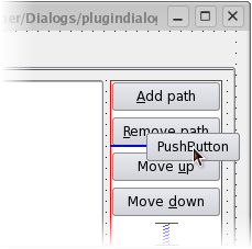
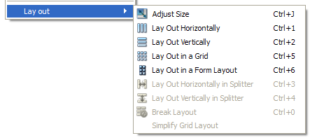
Using Layouts in Qt DesignerBefore a form can be used, the objects on the form need to be placed into layouts. This ensures that the objects will be displayed properly when the form is previewed or used in an application. Placing objects in a layout also ensures that they will be resized correctly when the form is resized. Applying and Breaking LayoutsThe simplest way to manage objects is to apply a layout to a group of existing objects. This is achieved by selecting the objects that you need to manage and applying one of the standard layouts using the main toolbar, the Form menu, or the form's context menu. Once widgets have been inserted into a layout, it is not possible to move and resize them individually because the layout itself controls the geometry of each widget within it, taking account of the hints provided by spacers. Instead, you must either break the layout and adjust each object's geometry manually, or you can influence the widget's geometry by resizing the layout. To break the layout, press Ctrl+0 or choose Break Layout from the form's context menu, the Form menu or the main toolbar. You can also add and remove spacers from the layout to influence the geometries of the widgets.
Setting A Top Level LayoutThe form's top level layout can be set by clearing the slection (click the left mouse button on the form itself) and applying a layout. A top level layout is necessary to ensure that your widgets will resize correctly when its window is resized. To check if you have set a top level layout, preview your widget and attempt to resize the window by dragging the size grip.
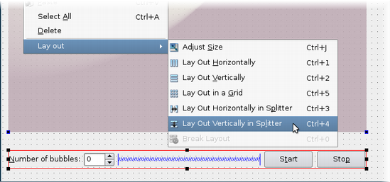
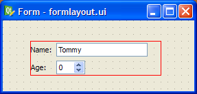
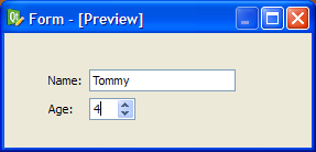
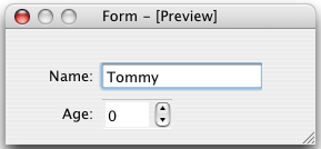
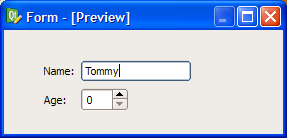
The simplest way to arrange objects on a form is to place them in a horizontal or vertical layout. Horizontal layouts ensure that the widgets within are aligned horizontally; vertical layouts ensure that they are aligned vertically. Horizontal and vertical layouts can be combined and nested to any depth. However, if you need more control over the placement of objects, consider using the grid layout. Complex form layouts can be created by placing objects in a grid layout. This kind of layout gives the form designer much more freedom to arrange widgets on the form, but can result in a much less flexible layout. However, for some kinds of form layout, a grid arrangement is much more suitable than a nested arrangement of horizontal and vertical layouts. Another common way to manage the layout of objects on a form is to place them in a splitter. These splitters arrange the objects horizontally or vertically in the same way as normal layouts, but also allow the user to adjust the amount of space allocated to each object. Although QSplitter is a container widget, Qt Designer treats splitter objects as layouts that are applied to existing widgets. To place a group of widgets into a splitter, select them as described here then apply the splitter layout by using the appropriate toolbar button, keyboard shortcut, or Lay out context menu entry. Since Qt 4.4, another layout class has been included -- QFormLayout. This class manages widgets in a two-column form; the left column holds labels and the right column holds field widgets such as line edits, spin boxes, etc. The QFormLayout class adheres to various platform look and feel guidelines and supports wrapping for long rows. The UI file above results in the previews shown below. In addition to the standard toolbar and context menu entries, there is also a set of keyboard shortcuts to apply layouts on widgets. Note: Ctrl+0 is used to break a layout. |


