Viadeo Twitter Google Bookmarks ! Facebook Digg del.icio.us MySpace Yahoo MyWeb Blinklist Netvouz Reddit Simpy StumbleUpon Bookmarks Windows Live Favorites 
Logo Documentation Qt ·  Page d'accueil  ·  Toutes les classes  ·  Toutes les fonctions  ·  Vues d'ensemble  · 

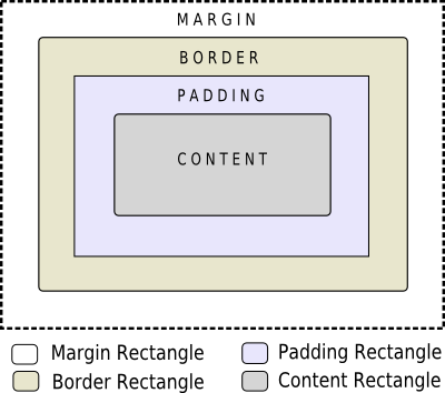
Customizing Qt Widgets Using Style Sheets

When using style sheets, every widget is treated as a box with four concentric rectangles: the margin rectangle, the border rectangle, the padding rectangle, and the content rectangle. The box model describes this in further detail.

The Box Model

The four concentric rectangles appear conceptually as below:

  • The margin falls outside the border.
  • The border is drawn between the margin and the padding.
  • The padding falls inside the border, between the border and the actual contents.
  • The content is what is left from the original widget or subcontrol once we have removed the margin, the border, and the padding.

The margin, border-width, and padding properties all default to zero. In that case, all four rectangles (margin, border, padding, and content) coincide exactly.

You can specify a background for the widget using the background-image property. By default, the background-image is drawn only for the area inside the border. This can be changed using the background-clip property. You can use background-repeat and background-origin to control the repetition and origin of the background image.

A background-image does not scale with the size of the widget. To provide a "skin" or background that scales along with the widget size, one must use border-image. Since the border-image property provides an alternate background, it is not required to specify a background-image when border-image is specified. In the case, when both of them are specified, the border-image draws over the background-image.

In addition, the image property may be used to draw an image over the border-image. The image specified does not tile or stretch and when its size does not match the size of the widget, its alignment is specified using the image-position property. Unlike background-image and border-image, one may specify a SVG in the image property, in which case the image is scaled automatically according to the widget size.

The steps to render a rule are as follows:

  • Set clip for entire rendering operation (border-radius)
  • Draw the background (background-image)
  • Draw the border (border-image, border)
  • Draw overlay image (image)

Sub-controls

A widget is considered as a hierarchy (tree) of subcontrols drawn on top of each other. For example, the QComboBox draws the drop-down sub-control followed by the down-arrow sub-control. A QComboBox is thus rendered as follows:

  • Render the QComboBox { } rule
  • Render the QComboBox::drop-down { } rule
  • Render the QComboBox::down-arrow { } rule

Sub-controls share a parent-child relationship. In the case of QComboBox, the parent of down-arrow is the drop-down and the parent of drop-down is the widget itself. Sub-controls are positioned within their parent using the subcontrol-position and subcontrol-origin properties.

Once positioned, sub-controls can be styled using the box model.

Note: With complex widgets such as QComboBox and QScrollBar, if one property or sub-control is customized, all the other properties or sub-controls must be customized as well.

Publicité

Best Of

Actualités les plus lues

Semaine
Mois
Année
  1. « Quelque chose ne va vraiment pas avec les développeurs "modernes" », un développeur à "l'ancienne" critique la multiplication des bibliothèques 44
  2. Microsoft ouvre aux autres compilateurs C++ AMP, la spécification pour la conception d'applications parallèles C++ utilisant le GPU 22
  3. Les développeurs ignorent-ils trop les failles découvertes dans leur code ? Prenez-vous en compte les remarques des autres ? 17
  4. RIM : « 13 % des développeurs ont gagné plus de 100 000 $ sur l'AppWord », Qt et open-source au menu du BlackBerry DevCon Europe 0
  5. BlackBerry 10 : premières images du prochain OS de RIM qui devrait intégrer des widgets et des tuiles inspirées de Windows Phone 0
  6. Quelles nouveautés de C++11 Visual C++ doit-il rapidement intégrer ? Donnez-nous votre avis 10
  7. Adieu qmake, bienvenue qbs : Qt Building Suite, un outil déclaratif et extensible pour la compilation de projets Qt 17
Page suivante

Le Qt Quarterly au hasard

Logo

Les développeurs viennent de Mars, les designers de Vénus

Qt Quarterly est la revue trimestrielle proposée par Nokia et à destination des développeurs Qt. Ces articles d'une grande qualité technique sont rédigés par des experts Qt. Lire l'article.

Communauté

Ressources

Liens utiles

Contact

  • Vous souhaitez rejoindre la rédaction ou proposer un tutoriel, une traduction, une question... ? Postez dans le forum Contribuez ou contactez-nous par MP ou par email (voir en bas de page).

Qt dans le magazine

Cette page est une traduction d'une page de la documentation de Qt, écrite par Nokia Corporation and/or its subsidiary(-ies). Les éventuels problèmes résultant d'une mauvaise traduction ne sont pas imputables à Nokia. Qt 4.7
Copyright © 2012 Developpez LLC. Tous droits réservés Developpez LLC. Aucune reproduction, même partielle, ne peut être faite de ce site et de l'ensemble de son contenu : textes, documents et images sans l'autorisation expresse de Developpez LLC. Sinon, vous encourez selon la loi jusqu'à 3 ans de prison et jusqu'à 300 000 E de dommages et intérêts. Cette page est déposée à la SACD.
Vous avez déniché une erreur ? Un bug ? Une redirection cassée ? Ou tout autre problème, quel qu'il soit ? Ou bien vous désirez participer à ce projet de traduction ? N'hésitez pas à nous contacter ou par MP !


Partenaires

Hébergement Web