CheckDelegate QML Type▲
-
Import Statement: import QtQuick.Controls
-
Inherits: ItemDelegate
-
Group: CheckDelegate is part of qtquickcontrols-delegates
Detailed Description▲

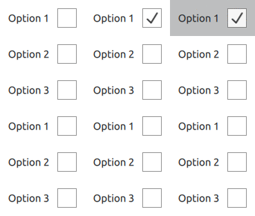
CheckDelegate presents an item delegate that can be toggled on (checked) or off (unchecked). Check delegates are typically used to select one or more options from a set of options in a list. For smaller sets of options, or for options that need to be uniquely identifiable, consider using CheckBox instead.
CheckDelegate inherits its API from ItemDelegate, which is inherited from AbstractButton. For instance, you can set text, and react to clicks using the AbstractButton API. The state of the check delegate can be set with the checked property.
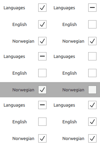
In addition to the checked and unchecked states, there is a third state: partially checked. The partially checked state can be enabled using the tristate property. This state indicates that the regular checked/unchecked state can not be determined; generally because of other states that affect the check delegate. This state is useful when several child nodes are selected in a treeview, for example.
ListView {
    model: ["Option 1", "Option 2", "Option 3"]
    delegate: CheckDelegate {
        text: modelData
    }
}
See Also▲
See also Customizing CheckDelegate, Delegate Controls, CheckBox
Property Documentation▲
checkState : enumeration▲
This property determines the check state of the check delegate.
Available states:
|
Constant |
Description |
|---|---|
|
Qt.Unchecked |
The delegate is unchecked. |
|
Qt.PartiallyChecked |
The delegate is partially checked. This state is only used when tristate is enabled. |
|
Qt.Checked |
The delegate is checked. |
See Also▲
[since QtQuick.Controls 2.4 (Qt 5.11)] nextCheckState : function▲
This property holds a callback function that is called to determine the next check state whenever the check delegate is interactively toggled by the user via touch, mouse, or keyboard.
By default, a normal check delegate cycles between Qt.Unchecked and Qt.Checked states, and a tri-state check delegate cycles between Qt.Unchecked, Qt.PartiallyChecked, and Qt.Checked states.
The nextCheckState callback function can override the default behavior. The following example implements a tri-state check delegate that can present a partially checked state depending on external conditions, but never cycles to the partially checked state when interactively toggled by the user.
CheckDelegate {
    tristate: true
    checkState: allChildrenChecked ? Qt.Checked :
                   anyChildChecked ? Qt.PartiallyChecked : Qt.Unchecked

    nextCheckState: function() {
        if (checkState === Qt.Checked)
            return Qt.Unchecked
        else
            return Qt.Checked
    }
}
This property was introduced in QtQuick.Controls 2.4 (Qt 5.11).
tristate : bool▲
This property determines whether the check delegate has three states.
In the animation below, the first checkdelegate is tri-state:

The default is false, i.e., the delegate has only two states.


