


Designing a Component with Qt Designer
In this chapter we will look at the main steps that users will take when creating new graphical user interfaces with Qt Designer. Usually, creating a new component for an application will involve various activities:
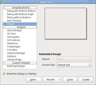
Users may find that they prefer to perform these activities in a different order, and we expect that for complex widgets the design process may involve many iterations of these steps. However, we present each of the activities in the above order, and leave it up to the user to find the approach that suits them best. To demonstrate the processes used to create a new component, we will take a look at the steps needed to create a simple dialog with Qt Designer. We use the dialog to illustrate certain features of the tool. General concepts are explained in the gray boxes in each section, and you can follow links from some of these to read more about the features being discussed. Creating a FormQt Designer can be used to create user interfaces for different purposes, and provides different kinds of form templates for each of these. The first choice that you face when creating a new user interface is to decide which kind of form you will be using; for example, you may require a dialog rather than a generic custom widget. New forms can be created by opening the File menu and selecting the New Form... option, or by pressing Ctrl+N.
If your requirements later change so that you need to supply a different type of component, you can easily reuse the contents of your existing form. For our example, we select the Dialog with Buttons Bottom template, and a form with Ok and Cancel buttons in the right bottom corner is created ready for use. Composing a DialogThe empty form is displayed as an empty dialog with a grid pattern overlayed on the widget area in a style similar to many drawing packages. Qt Designer provides four different editing modes:
We ensure that Qt Designer is in widget editing mode by opening the Edit menu and selecting Edit Widgets. This makes it possible for widgets to be dragged from the widget box onto the form. For our example, we will develop a dialog that lets the user create an image with a given size and color depth - these properties can be represented by spinboxes and a combobox. We will also provide a line edit so that the user can specify a name for the image if they want. Before we begin adding widgets to the form, it is useful to resize it to give us the required amount of space to work with. We can make the form larger than necessary because it can be resized later. We start composing the dialog by placing some text labels onto the form. This is achieved by dragging each Label from the Display Widgets section of the widget box onto the form. We add some Spin Boxes and a Combo Box from the Input Widgets section of the widget box, one Vertical Spacer and one Horizontal Spacer from the Spacers section (represented on the form as blue springs), and two Push Buttons from the Buttons section. Widgets and spacers can be moved around on the form by dragging them, or by using the cursor keys. A widget can be resized by dragging the resize handles that appear when it is selected - click the left mouse button over the widget to select it. It can be helpful to resize Label widgets so that all of their text is displayed, but this is not necessary as they will be displayed fully when we add them to a layout. It is useful to place the widgets where they are needed on the form because it helps visualize how it will appear when it is finished, but we do not need to fine tune the positions of widgets - this task is the responsibility of the form's layout objects which we will add later.
The widgets' initial values can be changed in the property editor which can be accessed by opening the Tools menu in Qt Designer's main window and selecting Property Editor, or by pressing Ctrl+I. The property editor always shows the properties of the currently selected object, so we just need to select each of the widgets in turn to access their properties. For the labels and push buttons, we only need to change the text property of each widget; for the spinboxes, we must change the value, minimum, and maximum properties. The dialog's window title can also be changed using the property editor - click on the form itself to access the dialog's properties. It is usually a good idea to give meaningful names to widgets in case you want to connect their signals to slots in other components, or refer to the widgets by name in your application.
Once all the widgets are in position, they need to be placed into one or more layouts. Layouts ensure that the widgets are the correct size, and are correctly positioned on the form. Creating a LayoutIn Qt, widget positions and sizes are organized by layout managers. Before a form can be used, it is necessary to put each of the widgets into layouts, and set the form's overall layout. Qt Designer provides all the standard types of layout, making it simple to experiment with different ways of arranging components. At any point during editing, we can experiment with the layout of widgets on the form by selecting a group of objects and applying a layout to them. Any of the standard Qt layouts (horizontal, vertical, and grid) can be used. To apply a layout to a selection of objects, click the appropriate icon in Qt Designer's tool bar, or select the layout from the form's context menu. We begin laying out our dialog by putting all the labels and their associated input widgets into a grid layout. To do this, we need to ensure that all the widgets are lined up in a grid arrangement. We put the push buttons into a horizontal layout with the horizontal spacer.
The property editor can also be used to change the appearance of layouts on the form. To access the properties of a layout, we click inside the layout, taking care not to click any of the widgets. The margin property controls the thickness of the margin around the edges of the layout, and spacing determines the space between widgets. By default, Qt Designer gives inner layouts a 1 pixel wide margin so that it can show a border around each object on the form. If you wish, you can set this to 0. We can create more complex layouts by selecting the layouts and placing them into other layouts. But, in our example, we really only need a top-level vertical layout to ensure that the dialog will appear correctly. To do this, we click the form to ensure that no objects are selected and then apply the vertical layout. The form may now be larger than necessary, but we can resize it to make it smaller.  Once all the objects on the form have been placed in layouts, we can concentrate on connecting them together using Qt's signals and slots mechanism. Configuring ConnectionsObjects on the form can be connected together using their signals and slots, making it unnecessary to write code in your application to connect many standard widgets together. In addition, Qt Designer's signal and slot editor provides a visual representation of the signal and slot connections in the form that can help other developers understand how the final component will behave. We will show how to configure a connection by connecting the returnPressed() signal of the line edit in our dialog to the OK button's animateClick() slot. We change into signals and slots editing mode by opening the Edit menu and selecting Edit Signals/Slots. The objects in the form will now become highlighted as the cursor passes over them.
When the cursor is over the OK button, we release the mouse button to complete the connection, and a dialog opens to allow us to choose compatible signals and slots. Since the returnPressed() signal and the animateClick() slot have compatible signatures, we can use them together to "click" the OK button whenever the return key is pressed in the line edit. To try this out, we can open a preview of the dialog by pressing Ctrl+R or by opening the Form menu and selecting Preview.
[Previous: Getting Started with Qt Designer] [Contents] [Next: Qt Designer's Widget Editing Mode] |
Publicité
Best OfActualités les plus luesSemaine
Mois
Année

Le Qt Quarterly au hasard
Des apparences personnalisées utilisant les feuilles de styleQt Quarterly est la revue trimestrielle proposée par Nokia et à destination des développeurs Qt. Ces articles d'une grande qualité technique sont rédigés par des experts Qt. Lire l'article.
CommunautéRessources
Liens utilesContact
Qt dans le magazine |


| Cette page est une traduction d'une page de la documentation de Qt, écrite par Nokia Corporation and/or its subsidiary(-ies). Les éventuels problèmes résultant d'une mauvaise traduction ne sont pas imputables à Nokia. | Qt 4.2 | |
| Copyright © 2012 Developpez LLC. Tous droits réservés Developpez LLC. Aucune reproduction, même partielle, ne peut être faite de ce site et de l'ensemble de son contenu : textes, documents et images sans l'autorisation expresse de Developpez LLC. Sinon, vous encourez selon la loi jusqu'à 3 ans de prison et jusqu'à 300 000 E de dommages et intérêts. Cette page est déposée à la SACD. | ||
| Vous avez déniché une erreur ? Un bug ? Une redirection cassée ? Ou tout autre problème, quel qu'il soit ? Ou bien vous désirez participer à ce projet de traduction ? N'hésitez pas à nous contacter ou par MP ! | ||
Copyright © 2000-2012 - www.developpez.com