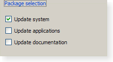
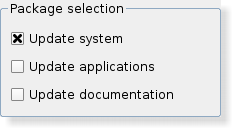
QGroupBox ClassThe QGroupBox widget provides a group box frame with a title. More... #include <QGroupBox>Inherits: QWidget. Inherited by: Public Types
PropertiesPublic Functions
Reimplemented Public Functions
Public Slots
Signals
Protected Functions
Reimplemented Protected Functions
Additional Inherited Members
Detailed DescriptionThe QGroupBox widget provides a group box frame with a title. A group box provides a frame, a title and a keyboard shortcut, and displays various other widgets inside itself. The title is on top, the keyboard shortcut moves keyboard focus to one of the group box's child widgets. QGroupBox also lets you set the title (normally set in the constructor) and the title's alignment. Group boxes can be checkable; child widgets in checkable group boxes are enabled or disabled depending on whether or not the group box is checked. You can minimize the space consumption of a group box by enabling the flat property. In most styles, enabling this property results in the removal of the left, right and bottom edges of the frame. QGroupBox doesn't automatically lay out the child widgets (which are often QCheckBoxes or QRadioButtons but can be any widgets). The following example shows how we can set up a QGroupBox with a layout: QGroupBox *groupBox = new QGroupBox(tr("Exclusive Radio Buttons")); QRadioButton *radio1 = new QRadioButton(tr("&Radio button 1")); QRadioButton *radio2 = new QRadioButton(tr("R&adio button 2")); QRadioButton *radio3 = new QRadioButton(tr("Ra&dio button 3")); radio1->setChecked(true); QVBoxLayout *vbox = new QVBoxLayout; vbox->addWidget(radio1); vbox->addWidget(radio2); vbox->addWidget(radio3); vbox->addStretch(1); groupBox->setLayout(vbox);
See also QButtonGroup and Group Box Example. Property Documentation
|
| Qt::Alignment | alignment() const |
| void | setAlignment(int alignment) |
See also Qt::Alignment.
checkable : bool
This property holds whether the group box has a checkbox in its title.
If this property is true, the group box displays its title using a checkbox in place of an ordinary label. If the checkbox is checked, the group box's children are enabled; otherwise they are disabled and inaccessible.
By default, group boxes are not checkable.
If this property is enabled for a group box, it will also be initially checked to ensure that its contents are enabled.
Access functions:
| bool | isCheckable() const |
| void | setCheckable(bool checkable) |
See also checked.
checked : bool
This property holds whether the group box is checked.
If the group box is checkable, it is displayed with a check box. If the check box is checked, the group box's children are enabled; otherwise the children are disabled and are inaccessible to the user.
By default, checkable group boxes are also checked.
Access functions:
| bool | isChecked() const |
| void | setChecked(bool checked) |
Notifier signal:
| void | toggled(bool on) |
See also checkable.
flat : bool
This property holds whether the group box is painted flat or has a frame.
A group box usually consists of a surrounding frame with a title at the top. If this property is enabled, only the top part of the frame is drawn in most styles; otherwise the whole frame is drawn.
By default, this property is disabled; i.e. group boxes are not flat unless explicitly specified.
Note: In some styles, flat and non-flat group boxes have similar representations and may not be as distinguishable as they are in other styles.
Access functions:
| bool | isFlat() const |
| void | setFlat(bool flat) |
See also title.
title : QString
This property holds the group box title text.
The group box title text will have a keyboard shortcut if the title contains an ampersand ('&') followed by a letter.
g->setTitle("&User information");
In the example above, Alt+U moves the keyboard focus to the group box. See the QShortcut documentation for details (to display an actual ampersand, use '&&').
There is no default title text.
Access functions:
| QString | title() const |
| void | setTitle(const QString & title) |
See also alignment.
Member Function Documentation
QGroupBox::QGroupBox(QWidget * parent = 0)
Constructs a group box widget with the given parent but with no title.
QGroupBox::QGroupBox(const QString & title, QWidget * parent = 0)
Constructs a group box with the given title and parent.
QGroupBox::~QGroupBox()
Destroys the group box.
void QGroupBox::changeEvent(QEvent * ev) [virtual protected]
Reimplemented from QWidget::changeEvent().
void QGroupBox::childEvent(QChildEvent * c) [virtual protected]
Reimplemented from QObject::childEvent().
void QGroupBox::clicked(bool checked = false) [signal]
This signal is emitted when the check box is activated (i.e. pressed down then released while the mouse cursor is inside the button), or when the shortcut key is typed, Notably, this signal is not emitted if you call setChecked().
If the check box is checked checked is true; it is false if the check box is unchecked.
This function was introduced in Qt 4.2.
See also checkable, toggled(), and checked.
bool QGroupBox::event(QEvent * e) [virtual protected]
Reimplemented from QObject::event().
void QGroupBox::focusInEvent(QFocusEvent * fe) [virtual protected]
Reimplemented from QWidget::focusInEvent().
void QGroupBox::initStyleOption(QStyleOptionGroupBox * option) const [protected]
Initialize option with the values from this QGroupBox. This method is useful for subclasses when they need a QStyleOptionGroupBox, but don't want to fill in all the information themselves.
See also QStyleOption::initFrom().
QSize QGroupBox::minimumSizeHint() const [virtual]
Reimplemented from QWidget::minimumSizeHint().
void QGroupBox::mouseMoveEvent(QMouseEvent * event) [virtual protected]
Reimplemented from QWidget::mouseMoveEvent().
void QGroupBox::mousePressEvent(QMouseEvent * event) [virtual protected]
Reimplemented from QWidget::mousePressEvent().
void QGroupBox::mouseReleaseEvent(QMouseEvent * event) [virtual protected]
Reimplemented from QWidget::mouseReleaseEvent().
void QGroupBox::paintEvent(QPaintEvent * event) [virtual protected]
Reimplemented from QWidget::paintEvent().
void QGroupBox::resizeEvent(QResizeEvent * e) [virtual protected]
Reimplemented from QWidget::resizeEvent().


