


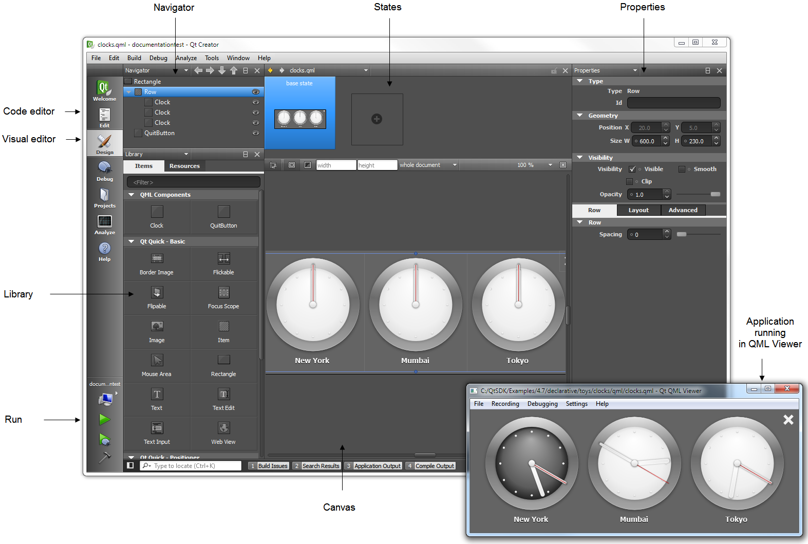
Using Qt Quick DesignerYou can edit .qml files in the Qt Quick Designer visual editor or in the code editor. In Projects, double-click a .qml file to open it in the code editor. Then select the Design mode to edit the file in the visual editor.
Use the visual editor panes to manage your project:
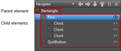
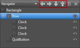
Managing Element HierarchyThe Navigator pane displays the QML elements in the current QML file and their relationships. Elements are listed in a tree structure, below their parent.
You can select elements in the Navigator to edit their properties in the Properties pane. Elements can access the properties of their parent element. To select elements on the canvas, right-click an element, and select another element in the context menu. Typically, child elements are located within the parent element on the canvas. However, they do not necessarily have to fit inside the parent element. For example, you might want to make a mouse area larger than the rectangle or image beneath it.
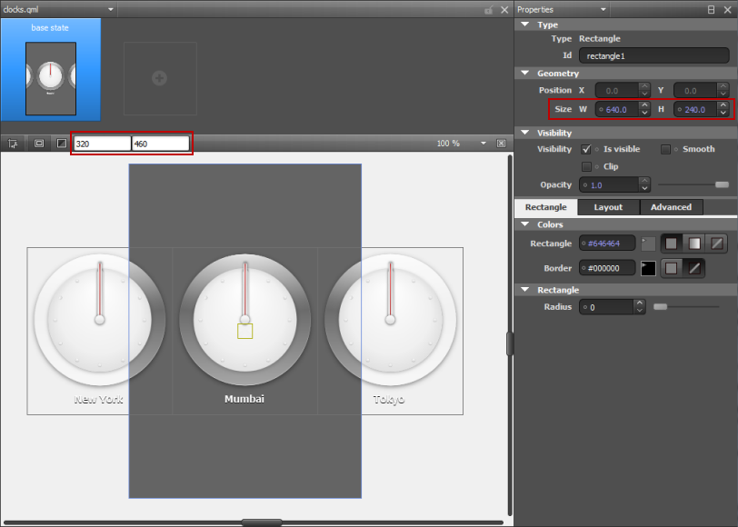
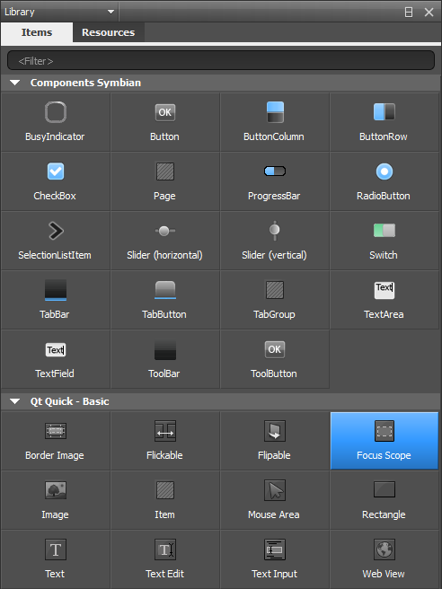
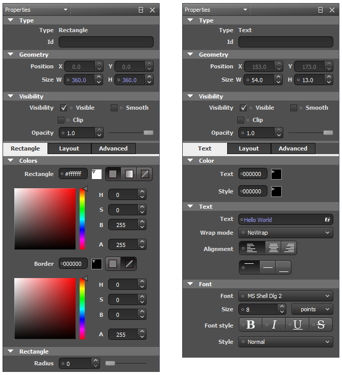
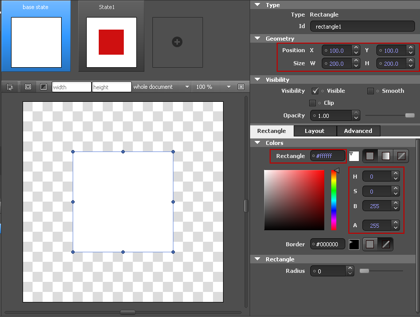
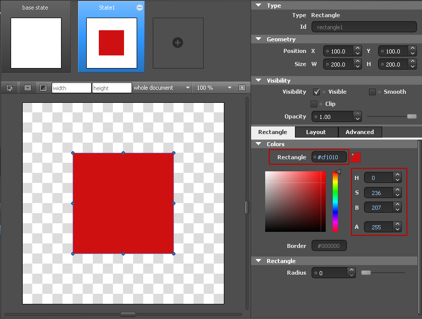
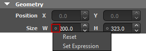
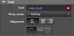
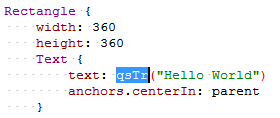
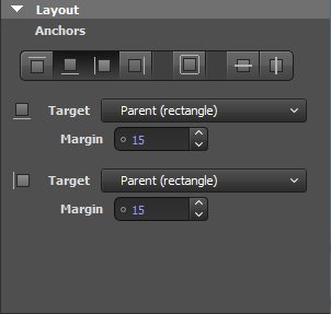
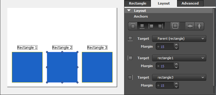
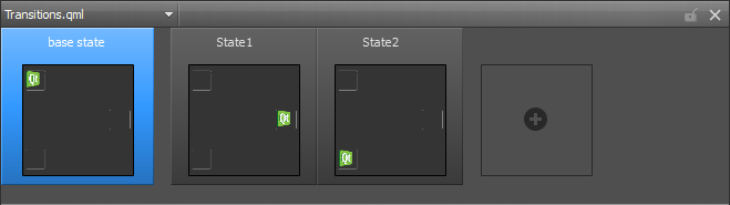
When you copy an element, all its child elements are also copied. When you remove an element, the child elements are also removed. You can show and hide items to focus on specific parts of the application. Click the As all properties, visibility and opacity are inherited from the parent element. To hide or show child elements, edit the properties of the parent element. To view lists of files or projects, instead, select File System, Open Documents, or Projects in the menu. To view several types of content at a time, split the sidebar by clicking Setting the Stacking OrderThe z property of an element determines its position in relation to its sibling elements in the element hierarchy. By default, elements with a higher stacking value are drawn on top of siblings with a lower stacking value. Elements with the same stacking value are drawn in the order they are listed, from the last item up. To change the stacking order of an item, right-click it on the canvas and select Stack (z). You can raise or lower the stack value of an item or move the item to the front or back of all its siblings. To remove the z property, select Reset. Switching Parent ElementsWhen you drag and drop QML elements to the canvas, Qt Quick Designer adds the new element as a child of the element beneath it. When you move elements on the canvas, Qt Quick Designer cannot determine whether you want to adjust their position or attach them to a new parent element. Therefore, the parent element is not automatically changed. To change the parent of the element, press down the Shift key before you drag and drop the element into a new position. The topmost element under the cursor becomes the new parent of the element. You can change the parent of an element also in the Navigator pane. Drag and drop the element to another position in the tree or use the arrow buttons to move the element in the tree. The Library pane contains two tabs: Items and Resources. The Items pane displays the QML elements grouped by type: your own QML components, basic elements, positioner elements, and views. Sets of UI components with the MeeGo and Symbian look and feel have been defined for Qt Quick. They are based on standard QML elements. To view the UI components in the Library pane, add import statements to the .pro file of your project: The Qt Quick Application wizard adds the import statements automatically when you select the component set to use for your project. The Resources pane displays the images and other files that you copy to the project folder (to the same subfolder as the QML files). The Properties pane displays all the properties of the selected QML element. The properties are grouped by type. The top part of the pane displays properties that are common to all elements, such as element type, position, size, and visibility. The bottom part of the pane displays properties that are specific to each element type. For example, the following image displays the properties you can set for Rectangle and Text elements. You can use a context-menu to reset some element properties. To reset the position or size property of an element, right-click the element and select Edit > Reset Position or Reset Size in the context menu. To set the visibility of the component, select Edit > Visibility. For more information on the properties available for an element, press F1. The default values of properties are displayed in white color, while the values that you specify explicitly are highlighted with blue color. In addition, property changes in states are highlighted with blue. This allows you to easily see which values are set in the .qml file and which values are default characteristics of an element or a component. When editing states, you can easily see which values are explicitly set in the current state and which values are derived from the base state. The following images illustrate this. In the base state, the Position, Size, and Colors values are explicitly set and highlighted. In State1, only the color is explicitly set and highlighted. Resetting a property sets it back to the default value and removes the value from the .qml file. Note: As a result, all boolean values can be visualized in four different ways. For example, visibility can be visualized as follows: Property binding is a declarative way of specifying the value of a property. Binding allows a property value to be expressed as an JavaScript expression that defines the value relative to other property values or data accessible in the application. The property value is automatically kept up to date if the other properties or data values change. Property bindings are created implicitly in QML whenever a property is assigned an JavaScript expression. To set JavaScript expressions as values of properties in Qt Quick Designer, click the circle icon next to a property to open a context menu, and select Set Expression. To remove expressions, select Reset in the context menu. For more information on the JavaScript environment provided by QML, see Integrating JavaScript. To support translators, mark each text element that should be translated. In the Properties pane, Text field, select tr. The text string is enclosed in a qsTr call. Qt Quick Designer supports views, models, and delegates, so that when you add a Grid View, List View, or Path View element, the ListModel and the delegate component are added automatically. However, the missing context of the application presents a challenge for Qt Quick Designer. Specific models defined in C++ are the most obvious case. Often, the context is missing simple properties, which are either defined in C++, or in other QML files. A typical example is a component which uses the properties of its parent, such as parent.width. If you open a file in Qt Quick Designer that references a C++ model, you see nothing on the canvas. If the data in the model is fetched from the internet, you have no control over it. To get reliable data, dummy data was introduced. For example, the following code snippet describes the file example.qml that contains a ListView that in turn specifies a C++ model: Create a directory named dummydata in the root directory of the project, so that it is not deployed to the device. In the dummydata directory, create a QML file that has the same name as the value of model: Then create the dataModel.qml file that contains the dummy data: The following example presents a common pattern in QML: This works nicely for applications but Qt Quick Designer displays a zero-sized item. A parent for the opened file does not exist, because the context is missing. To get around the missing context, the idea of a dummy context is introduced. If you place a file with the same name as the application (here, example.qml) in the dummydata/context directory, you can fake a parent context: In addition to arranging elements in a grid, row, or column, you can use anchors to lay out screens. In an anchor-based layout, each item can be thought of as having a set of invisible anchor lines: top, bottom, left, right, fill, horizontal center, vertical center, and baseline. In the Layout pane you can set anchors and margins for elements. To set the anchors of an item, click the anchor buttons. You can combine the top/bottom, left/right, and horizontal/vertical anchors to anchor objects in the corners of the parent element or center them horizontally or vertically within the parent element. In version 2.1, specifying the baseline anchor in Qt Quick Designer is not supported. You can specify it using the code editor. For performance reasons, you can only anchor an element to its siblings and direct parent. By default, an element is anchored to its parent when you use the anchor buttons. Select a sibling of the element in the Target field to anchor to it, instead. Arbitrary anchoring is not supported. For example, you cannot specify: anchor.left: parent.right. You have to specify: anchor.left: parent.left. When you use the anchor buttons, anchors to the parent element are always specified to the same side. However, anchors to sibling elements are specified to the opposite side: anchor.left: sibling.right. This allows you to keep sibling elements together. In the following image, Rectangle 2 is anchored to its siblings on its right and left and to the bottom of its parent. The anchors for Rectangle 2 are specified as follows in code: Margins specify the amount of empty space to leave to the outside of an item. Margins only have meaning for anchors. They do not take any effect when using other layouts or absolute positioning. The Advanced pane allows you to configure advanced transformations, such as rotation, scale, and translation. You can assign any number of transformations to an item. Each transformation is applied in order, one at a time. For more information on Transform elements, see QML Transform Element. User interfaces are designed to present different interface configurations in different scenarios, or to modify their appearances in response to user interaction. Often, there are a set of changes that are made concurrently, such that the interface could be seen to be internally changing from one state to another. This applies generally to interface elements regardless of their complexity. A photo viewer may initially present images in a grid, and when an image is clicked, change to a detailed state where the individual image is expanded and the interface is changed to present new options for image editing. On the other end of the scale, when a simple button is pressed, it may change to a pressed state in which its color and position is modified to give a pressed appearance. In QML, any object can change between different states to apply sets of changes that modify the properties of relevant items. Each state can present a different configuration that can, for example: The State pane displays the different states of the component in the Qt Quick Designer. To add states, click the empty slot. Then modify the new state in the editor. For example, to change the appearance of a button, you can hide the button image and show another image in its place. Or, to add movement to the screen, you can change the position of an object on the canvas and then add animation to the change between the states. You can preview the states in the State pane and click them to switch between states on the canvas. For more information on using states, see Creating Screens. If you add animation to the states, you can run the application to test the animation. For more information on adding animation, see Animating Screens. The position of an element on the canvas can be either absolute or relative to other elements. In the element properties, you can set the x and y coordinates of an element, or anchor it to its parent and sibling elements. When you are working on a design, you can use snap and guides to align elements on the canvas. Click the Choose Tools > Options... > Qt Quick to specify settings for snap to margins. In the Snap margin field, specify the position of the guides as pixels from the edge of the canvas. In the Item spacing field, specify the space in pixels to leave between elements on the screen. The following image shows the position of the guides when Snap margin is set to 5 pixels. Qt Quick Designer displays the boundaries of elements on the canvas. To hide the element boundaries, click the When you point the mouse to overlapping elements, the frontmost element is selected by default. However, elements that do not have any content, such as the mouse area, are typically located in front of elements that do have content, such as rectangles or border images. To select elements with content by default, click the The width and height of the root item in a QML file determine the size of the QML element. You can reuse elements, such as buttons, in different sizes in other QML files and design screens for use with different device profiles, screen resolution, or screen orientation. The component size might also be zero (0,0) if its final size is determined by property bindings. To experiment with different element sizes, enter values in the Height and Width fields on the canvas toolbar. The changes are displayed in the States pane and on the canvas, but the property values are not changed permanently in the QML file. You can permanently change the property values in the Properties pane. To change the canvas size, select Tools > Options... > Qt Quick and specify the canvas width and height in the Canvas group. When you open QML files in Qt Quick Designer, the QML elements in the file are drawn on the canvas. When you edit the element properties in Qt Quick Designer, the QML file and the image on the canvas might get out of sync. For example, when you change the position of an item within a column or a row, the new position might not be displayed correctly on the canvas. To refresh the image on the canvas, press R or select the Reset View button on the canvas toolbar. X
|
 icon to change the visibility of an element on the canvas. To change the visibility of an element in the application, use the Visibility check box or the Opacity field in the Properties pane. If you set Opacity to 0, elements are hidden, but you can still apply animation to them.
 .
.


 button to have the elements snap to the guides.
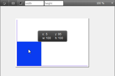
 button.
 button.