


Action QML Type▲
-
Import Statement: import QtQuick.Controls 1.4
-
Group: Action is part of Application Window, Buttons and Controls
Detailed Description▲
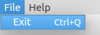
In applications many common commands can be invoked via menus, toolbar buttons, and keyboard shortcuts. Since the user expects each command to be performed in the same way, regardless of the user interface used, it is useful to represent each command as an action.
An action can be bound to a menu item and a toolbar button, and it will automatically keep them in sync. For example, in a word processor, if the user presses a Bold toolbar button, the Bold menu item will automatically be checked.
QtQuick Controls supports actions in Button, ToolButton, and MenuItem.
    ...
    Action {
        id: copyAction
        text: "&Copy"
        shortcut: StandardKey.Copy
        iconName: "edit-copy"
        enabled: (!!activeFocusItem && !!activeFocusItem["copy"])
        onTriggered: activeFocusItem.copy()
    }

    Action {
        id: cutAction
        text: "Cu&t"
        shortcut: StandardKey.Cut
        iconName: "edit-cut"
        enabled: (!!activeFocusItem && !!activeFocusItem["cut"])
        onTriggered: activeFocusItem.cut()
    }

    Action {
        id: pasteAction
        text: "&Paste"
        shortcut: StandardKey.Paste
        iconName: "edit-paste"
        enabled: (!!activeFocusItem && !!activeFocusItem["paste"])
        onTriggered: activeFocusItem.paste()
    }

    toolBar: ToolBar {
        RowLayout {
            anchors.fill: parent
            anchors.margins: spacing
            Label {
                text: UI.label
            }
            Item { Layout.fillWidth: true }
            CheckBox {
                id: enabler
                text: "Enabled"
                checked: true
            }
        }
    }

    menuBar: MenuBar {
        Menu {
            title: "&File"
            MenuItem {
                text: "E&xit"
                shortcut: StandardKey.Quit
                onTriggered: Qt.quit()
            }
        }
        Menu {
            title: "&Edit"
            visible: tabView.currentIndex == 2
            MenuItem { action: cutAction }
            MenuItem { action: copyAction }
            MenuItem { action: pasteAction }
        }
        Menu {
            title: "&Help"
            MenuItem {
                text: "About..."
                onTriggered: aboutDialog.open()
            }
        }
    }
    ...
Property Documentation▲
checkable : bool▲
Whether the menu item can be checked, or toggled. Defaults to false.
See Also▲
See also checked, exclusiveGroup
checked : bool▲
If the action is checkable, this property reflects its checked state. Defaults to false. Its value is also false while checkable is false.
See Also▲
See also toggled, exclusiveGroup
enabled : bool▲
Whether the action is enabled, and can be triggered. Defaults to true.
See Also▲
exclusiveGroup : ExclusiveGroup▲
If an action is checkable, an ExclusiveGroup can be attached to it. All the actions sharing the same exclusive group become mutually exclusive selectable, meaning that only the last checked action will actually be checked.
Defaults to null, meaning no exclusive behavior is to be expected.
See Also▲
iconName : string▲
Sets the icon name for the action. This will pick the icon with the given name from the current theme.
Defaults to an empty string.
This property requires QApplication.
iconSource : url▲
Sets the icon file or resource url for the action. Defaults to an empty URL.
shortcut : keysequence▲
Shortcut bound to the action. The keysequence can be a string or a standard key.
Defaults to an empty string.
Action {
    id: copyAction
    text: qsTr("&Copy")
    shortcut: StandardKey.Copy
}
text : string▲
Text for the action. This text will show as the button text, or as title in a menu item.
Mnemonics are supported by prefixing the shortcut letter with &. For instance, "\&Open" will bind the Alt-O shortcut to the "Open" menu item. Note that not all platforms support mnemonics.
Defaults to an empty string.
tooltip : string▲
Tooltip to be shown when hovering the control bound to this action. Not all controls support tooltips on all platforms, especially MenuItem.
Defaults to an empty string.
Signal Documentation▲
toggled(checked)▲
Emitted whenever a action's checked property changes. This usually happens at the same time as triggered.
The corresponding handler is onToggled.
The corresponding handler is onToggled.
triggered(QObject *source)▲
Emitted when either the menu item or its bound action have been activated. Includes the object that triggered the event if relevant (e.g. a Button or MenuItem). You shouldn't need to emit this signal, use trigger() instead.
The corresponding handler is onTriggered.
The corresponding handler is onTriggered.