


QPushButton Class Reference |
 | A push button shown in the Macintosh widget style. Note that when a button's width becomes smaller than 50 or its height becomes smaller than 30, the button's corners are changed from round to square. Use the setMinimumSize() function to prevent this behavior. |
 | A push button shown in the Windows XP widget style. |
 | A push button shown in the Plastique widget style. |
In Qt, the QAbstractButton base class provides most of the modes and other API, and QPushButton provides GUI logic. See QAbstractButton for more information about the API.
See also QToolButton, QRadioButton, QCheckBox, and GUI Design Handbook: Push Button.
Property Documentation
autoDefault : bool
This property holds whether the push button is the auto default button.
If this property is set to true then the push button is the auto default button in a dialog.
In some GUI styles a default button is drawn with an extra frame around it, up to 3 pixels or more. Qt automatically keeps this space free around auto-default buttons, i.e. auto-default buttons may have a slightly larger size hint.
This property's default is true for buttons that have a QDialog parent; otherwise it defaults to false.
See the default property for details of how default and auto-default interact.
Access functions:
- bool autoDefault () const
- void setAutoDefault ( bool )
default : bool
This property holds whether the push button is the default button.
If this property is set to true then the push button will be pressed if the user presses the Enter (or Return) key in a dialog.
Regardless of focus, if the user presses Enter: If there is a default button the default button is pressed; otherwise, if there are one or more autoDefault buttons the first autoDefault button that is next in the tab order is pressed. If there are no default or autoDefault buttons only pressing Space on a button with focus, mouse clicking, or using a shortcut will press a button.
In a dialog, only one push button at a time can be the default button. This button is then displayed with an additional frame (depending on the GUI style).
The default button behavior is provided only in dialogs. Buttons can always be clicked from the keyboard by pressing Spacebar when the button has focus.
This property's default is false.
Access functions:
- bool isDefault () const
- void setDefault ( bool )
flat : bool
This property holds whether the border is disabled.
This property's default is false.
Access functions:
- bool isFlat () const
- void setFlat ( bool )
Member Function Documentation
QPushButton::QPushButton ( QWidget * parent = 0 )
Constructs a push button with no text and a parent.
QPushButton::QPushButton ( const QString & text, QWidget * parent = 0 )
Constructs a push button with the parent parent and the text text.
QPushButton::QPushButton ( const QIcon & icon, const QString & text, QWidget * parent = 0 )
Constructs a push button with an icon and a text, and a parent.
Note that you can also pass a QPixmap object as an icon (thanks to the implicit type conversion provided by C++).
QPushButton::~QPushButton ()
Destroys the push button.
QMenu * QPushButton::menu () const
Returns the button's associated popup menu or 0 if no popup menu has been set.
See also setMenu().
void QPushButton::setMenu ( QMenu * menu )
Associates the popup menu menu with this push button. This turns the button into a menu button, which in some styles will produce a small triangle to the right of the button's text.
Ownership of the menu is not transferred to the push button.
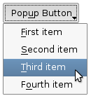 | 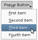 | Push buttons with popup menus shown in the Plastique widget style (left) and Cleanlooks widget style (right). |
See also menu().
void QPushButton::showMenu () [slot]
Shows (pops up) the associated popup menu. If there is no such menu, this function does nothing. This function does not return until the popup menu has been closed by the user.
Member Function Documentation
QPushButton::QPushButton ( QWidget * parent, const char * name )
Use one of the constructors that doesn't take the name argument and then use setObjectName() instead.
QPushButton::QPushButton ( const QString & text, QWidget * parent, const char * name )
Use one of the constructors that doesn't take the name argument and then use setObjectName() instead.
QPushButton::QPushButton ( const QIcon & icon, const QString & text, QWidget * parent, const char * name )
Use one of the constructors that doesn't take the name argument and then use setObjectName() instead.
bool QPushButton::isMenuButton () const
Use menu() != 0 instead.
void QPushButton::openPopup ()
Use showMenu() instead.
QMenu * QPushButton::popup () const
Use menu() instead.
See also setPopup().
void QPushButton::setPopup ( QMenu * popup )
Use setMenu() instead.
See also popup().
Best Of
Actualités les plus lues
- « Quelque chose ne va vraiment pas avec les développeurs "modernes" », un développeur à "l'ancienne" critique la multiplication des bibliothèques 9
- Quelles nouveautés de C++11 Visual C++ doit-il rapidement intégrer ? Donnez-nous votre avis 10
- Partage de données explicite et implicite avec Qt, un article de Christophe Dumez traduit par Thibaut Cuvelier 0
- Créer des applications avec un style Metro avec Qt, exemples en QML et C++, un article du blog Digia traduit par Thibaut Cuvelier 0
- Microsoft ouvre aux autres compilateurs C++ AMP, la spécification pour la conception d'applications parallèles C++ utilisant le GPU 22
- Les développeurs ignorent-ils trop les failles découvertes dans leur code ? Prenez-vous en compte les remarques des autres ? 17
- RIM : « 13 % des développeurs ont gagné plus de 100 000 $ sur l'AppWord », Qt et open-source au menu du BlackBerry DevCon Europe 0
- BlackBerry 10 : premières images du prochain OS de RIM qui devrait intégrer des widgets et des tuiles inspirées de Windows Phone 0
- Adieu qmake, bienvenue qbs : Qt Building Suite, un outil déclaratif et extensible pour la compilation de projets Qt 17
- Quelles nouveautés de C++11 Visual C++ doit-il rapidement intégrer ? Donnez-nous votre avis 10
- La rubrique Qt a besoin de vous ! 1

- Linus Torvalds : le "C++ est un langage horrible", en justifiant le choix du C pour le système de gestion de version Git 100
- Comment prendre en compte l'utilisateur dans vos applications ? Pour un développeur, « 90 % des utilisateurs sont des idiots » 229
- Quel est LE livre que tout développeur doit lire absolument ? Celui qui vous a le plus marqué et inspiré 96
- Apple cède et s'engage à payer des droits à Nokia, le conflit des brevets entre les deux firmes s'achève 158
- Nokia porte à nouveau plainte contre Apple pour violation de sept nouveaux brevets 158
- Quel est le code dont vous êtes le plus fier ? Pourquoi l'avez-vous écrit ? Et pourquoi vous a-t-il donné autant de satisfaction ? 83
- Le Draft final de la norme C++ 0X validé 181
Le Qt Quarterly au hasard

Des apparences personnalisées utilisant les feuilles de style
Communauté
Ressources
- 91 cours et tutoriels Qt
- F.A.Q. Qt : 200 questions et réponses
- 48 Qt Quarterly, 35 Qt Labs et 22 Qt DevNet en français
- 43 outils Qt
- 99 sources Qt
- 26 binaires Qt
- 6 livres Qt et 9 critiques
- La documentation de Qt 4.7 en français : 157 classes, 70 concepts et 24 modules
- 3 certifications Qt
Liens utiles
Contact
- Vous souhaitez rejoindre la rédaction ou proposer un tutoriel, une traduction, une question... ? Postez dans le forum Contribuez ou contactez-nous par MP ou par email (voir en bas de page).
Qt dans le magazine
| Cette page est une traduction d'une page de la documentation de Qt, écrite par Nokia Corporation and/or its subsidiary(-ies). Les éventuels problèmes résultant d'une mauvaise traduction ne sont pas imputables à Nokia. | Qt 4.2 | |
| Copyright © 2012 Developpez LLC. Tous droits réservés Developpez LLC. Aucune reproduction, même partielle, ne peut être faite de ce site et de l'ensemble de son contenu : textes, documents et images sans l'autorisation expresse de Developpez LLC. Sinon, vous encourez selon la loi jusqu'à 3 ans de prison et jusqu'à 300 000 E de dommages et intérêts. Cette page est déposée à la SACD. | ||
| Vous avez déniché une erreur ? Un bug ? Une redirection cassée ? Ou tout autre problème, quel qu'il soit ? Ou bien vous désirez participer à ce projet de traduction ? N'hésitez pas à nous contacter ou par MP ! | ||
Copyright © 2000-2012 - www.developpez.com