


QTabBar Class Reference |
|
|
Public Functions
- QTabBar ( QWidget * parent = 0 )
- ~QTabBar ()
- int addTab ( const QString & text )
- int addTab ( const QIcon & icon, const QString & text )
- int count () const
- int currentIndex () const
- bool drawBase () const
- Qt::TextElideMode elideMode () const
- QSize iconSize () const
- int insertTab ( int index, const QString & text )
- int insertTab ( int index, const QIcon & icon, const QString & text )
- bool isTabEnabled ( int index ) const
- void removeTab ( int index )
- void setDrawBase ( bool drawTheBase )
- void setElideMode ( Qt::TextElideMode )
- void setIconSize ( const QSize & size )
- void setShape ( Shape shape )
- void setTabData ( int index, const QVariant & data )
- void setTabEnabled ( int index, bool enabled )
- void setTabIcon ( int index, const QIcon & icon )
- void setTabText ( int index, const QString & text )
- void setTabTextColor ( int index, const QColor & color )
- void setTabToolTip ( int index, const QString & tip )
- void setTabWhatsThis ( int index, const QString & text )
- void setUsesScrollButtons ( bool useButtons )
- Shape shape () const
- QVariant tabData ( int index ) const
- QIcon tabIcon ( int index ) const
- QRect tabRect ( int index ) const
- QString tabText ( int index ) const
- QColor tabTextColor ( int index ) const
- QString tabToolTip ( int index ) const
- QString tabWhatsThis ( int index ) const
- bool usesScrollButtons () const
- 195 public functions inherited from QWidget
- 29 public functions inherited from QObject
- 12 public functions inherited from QPaintDevice
Public Slots
- void setCurrentIndex ( int index )
Signals
- void currentChanged ( int index )
Protected Functions
- virtual void tabInserted ( int index )
- virtual void tabLayoutChange ()
- virtual void tabRemoved ( int index )
- virtual QSize tabSizeHint ( int index ) const
- 38 protected functions inherited from QWidget
- 7 protected functions inherited from QObject
- 1 protected function inherited from QPaintDevice
Additional Inherited Members
- 4 static public members inherited from QWidget
- 5 static public members inherited from QObject
- 1 protected slot inherited from QWidget
Detailed Description
The QTabBar class provides a tab bar, e.g. for use in tabbed dialogs.
QTabBar is straightforward to use; it draws the tabs using one of the predefined shapes, and emits a signal when a tab is selected. It can be subclassed to tailor the look and feel. Qt also provides a ready-made QTabWidget.
Each tab has a tabText(), an optional tabIcon(), an optional tabToolTip(), optional tabWhatsThis() and optional tabData(). The tabs's attributes can be changed with setTabText(), setTabIcon(), setTabToolTip(), setTabWhatsThis and setTabData(). Each tabs can be enabled or disabled individually with setTabEnabled().
Each tab can display text in a distinct color. The current text color for a tab can be found with the tabTextColor() function. Set the text color for a particular tab with setTabTextColor().
Tabs are added using addTab(), or inserted at particular positions using insertTab(). The total number of tabs is given by count(). Tabs can be removed from the tab bar with removeTab(). Combining removeTab() and insertTab() allows you to move tabs to different positions.
The shape property defines the tabs' appearance. The choice of shape is a matter of taste, although tab dialogs (for preferences and similar) invariably use RoundedNorth. Tab controls in windows other than dialogs almost always use either RoundedSouth or TriangularSouth. Many spreadsheets and other tab controls in which all the pages are essentially similar use TriangularSouth, whereas RoundedSouth is used mostly when the pages are different (e.g. a multi-page tool palette). The default in QTabBar is RoundedNorth.
The most important part of QTabBar's API is the currentChanged() signal. This is emitted whenever the current tab changes (even at startup, when the current tab changes from 'none'). There is also a slot, setCurrentIndex(), which can be used to select a tab programmatically. The function currentIndex() returns the index of the current tab, count holds the number of tabs.
QTabBar creates automatic mnemonic keys in the manner of QAbstractButton; e.g. if a tab's label is "&Graphics", Alt+G becomes a shortcut key for switching to that tab.
The following virtual functions may need to be reimplemented in order to tailor the look and feel or store extra data with each tab:
- tabSizeHint() calcuates the size of a tab.
- tabInserted() notifies that a new tab was added.
- tabRemoved() notifies that a tab was removed.
- tabLayoutChange() notifies that the tabs have been re-laid out.
- paintEvent() paints all tabs.
For subclasses, you might also need the tabRect() functions which returns the visual geometry of a single tab.
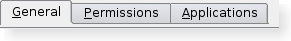 | A tab bar shown in the Plastique widget style. |
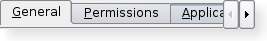 | A truncated tab bar shown in the Plastique widget style. |
See also QTabWidget.
Member Type Documentation
enum QTabBar::Shape
This enum type lists the built-in shapes supported by QTabBar. Treat these as hints as some styles may not render some of the shapes. However, position should be honored.
| Constant | Value | Description |
|---|---|---|
| QTabBar::RoundedNorth | 0 | The normal rounded look above the pages |
| QTabBar::RoundedSouth | 1 | The normal rounded look below the pages |
| QTabBar::RoundedWest | 2 | The normal rounded look on the left side of the pages |
| QTabBar::RoundedEast | 3 | The normal rounded look on the right side the pages |
| QTabBar::TriangularNorth | 4 | Triangular tabs above the pages. |
| QTabBar::TriangularSouth | 5 | Triangular tabs similar to those used in the Excel spreadsheet, for example |
| QTabBar::TriangularWest | 6 | Triangular tabs on the left of the pages. |
| QTabBar::TriangularEast | 7 | Triangular tabs on the right of the pages. |
Property Documentation
count : const int
This property holds the number of tabs in the tab bar.
Access functions:
- int count () const
currentIndex : int
This property holds the index of the tab bar's visible tab.
Access functions:
- int currentIndex () const
- void setCurrentIndex ( int index )
drawBase : bool
This property holds defines whether or not tabbar should draw its base.
If true then QTabBar draws a base in relation to the styles overlab. Otherwise only the tabs are drawn.
Access functions:
- bool drawBase () const
- void setDrawBase ( bool drawTheBase )
See also QStyle::pixelMetric(), QStyle::PM_TabBarBaseOverlap, and QStyleOptionTabBarBase.
elideMode : Qt::TextElideMode
This property holds how to elide text in the tab bar.
This property controls how items are elided when there is not enough space to show them for a given tab bar size.
By default the value is style dependent.
This property was introduced in Qt 4.2.
Access functions:
- Qt::TextElideMode elideMode () const
- void setElideMode ( Qt::TextElideMode )
See also QTabWidget::elideMode, usesScrollButtons, and QStyle::SH_TabBar_ElideMode.
iconSize : QSize
This property holds the size for icons in the tab bar.
The default value is style-dependent.
This property was introduced in Qt 4.1.
Access functions:
- QSize iconSize () const
- void setIconSize ( const QSize & size )
See also QTabWidget::iconSize.
shape : Shape
This property holds the shape of the tabs in the tab bar.
Possible values for this property are described by the Shape enum.
Access functions:
- Shape shape () const
- void setShape ( Shape shape )
usesScrollButtons : bool
This property holds whether or not a tab bar should use buttons to scroll tabs when it has many tabs.
When there are too many tabs in a tab bar for its size, the tab bar can either choose to expand it's size or to add buttons that allow you to scroll through the tabs.
By default the value is style dependant.
This property was introduced in Qt 4.2.
Access functions:
- bool usesScrollButtons () const
- void setUsesScrollButtons ( bool useButtons )
See also elideMode, QTabWidget::usesScrollButtons, and QStyle::SH_TabBar_PreferNoArrows.
Member Function Documentation
QTabBar::QTabBar ( QWidget * parent = 0 )
Creates a new tab bar with the given parent.
QTabBar::~QTabBar ()
Destroys the tab bar.
int QTabBar::addTab ( const QString & text )
Adds a new tab with text text. Returns the new tab's index.
int QTabBar::addTab ( const QIcon & icon, const QString & text )
This is an overloaded member function, provided for convenience.
Adds a new tab with icon icon and text text. Returns the new tab's index.
void QTabBar::currentChanged ( int index ) [signal]
This signal is emitted when the tab bar's current tab changes. The new current has the given index.
int QTabBar::insertTab ( int index, const QString & text )
Inserts a new tab with text text at position index. If index is out of range, the new tab is appened. Returns the new tab's index.
int QTabBar::insertTab ( int index, const QIcon & icon, const QString & text )
This is an overloaded member function, provided for convenience.
Inserts a new tab with icon icon and text text at position index. If index is out of range, the new tab is appended. Returns the new tab's index.
If the QTabBar was empty before this function is called, the inserted tab becomes the current tab.
Inserting a new tab at an index less than or equal to the current index will increment the current index, but keep the current tab.
bool QTabBar::isTabEnabled ( int index ) const
Returns true if the tab at position index is enabled; otherwise returns false.
void QTabBar::removeTab ( int index )
Removes the tab at position index.
void QTabBar::setTabData ( int index, const QVariant & data )
Sets the data of the tab at position index to data.
See also tabData().
void QTabBar::setTabEnabled ( int index, bool enabled )
If enabled is true then the tab at position index is enabled; otherwise the item at position index is disabled.
See also isTabEnabled().
void QTabBar::setTabIcon ( int index, const QIcon & icon )
Sets the icon of the tab at position index to icon.
See also tabIcon().
void QTabBar::setTabText ( int index, const QString & text )
Sets the text of the tab at position index to text.
See also tabText().
void QTabBar::setTabTextColor ( int index, const QColor & color )
Sets the color of the text in the tab with the given index to the specified color.
If an invalid color is specified, the tab will use the QTabBar foreground role instead.
See also tabTextColor().
void QTabBar::setTabToolTip ( int index, const QString & tip )
Sets the tool tip of the tab at position index to tip.
See also tabToolTip().
void QTabBar::setTabWhatsThis ( int index, const QString & text )
Sets the What's This help text of the tab at position index to text.
This function was introduced in Qt 4.1.
See also tabWhatsThis().
QVariant QTabBar::tabData ( int index ) const
Returns the datad of the tab at position index, or a null variant if index is out of range.
See also setTabData().
QIcon QTabBar::tabIcon ( int index ) const
Returns the icon of the tab at position index, or a null icon if index is out of range.
See also setTabIcon().
void QTabBar::tabInserted ( int index ) [virtual protected]
This virtual handler is called after a new tab was added or inserted at position index.
See also tabRemoved().
void QTabBar::tabLayoutChange () [virtual protected]
This virtual handler is called whenever the tab layout changes.
See also tabRect().
QRect QTabBar::tabRect ( int index ) const
Returns the visual rectangle of the of the tab at position index, or a null rectangle if index is out of range.
void QTabBar::tabRemoved ( int index ) [virtual protected]
This virtual handler is called after a tab was removed from position index.
See also tabInserted().
QSize QTabBar::tabSizeHint ( int index ) const [virtual protected]
Returns the size hint for the tab at position index.
QString QTabBar::tabText ( int index ) const
Returns the text of the tab at position index, or an empty string if index is out of range.
See also setTabText().
QColor QTabBar::tabTextColor ( int index ) const
Returns the text color of the tab with the given index, or a invalid color if index is out of range.
See also setTabTextColor().
QString QTabBar::tabToolTip ( int index ) const
Returns the tool tip of the tab at position index, or an empty string if index is out of range.
See also setTabToolTip().
QString QTabBar::tabWhatsThis ( int index ) const
Returns the What's This help text of the tab at position index, or an empty string if index is out of range.
This function was introduced in Qt 4.1.
See also setTabWhatsThis().
Member Function Documentation
void QTabBar::selected ( int index ) [signal]
Use currentChanged() instead.
void QTabBar::setCurrentTab ( int index ) [slot]
Use setCurrentIndex() instead.
Best Of
Actualités les plus lues
- « Quelque chose ne va vraiment pas avec les développeurs "modernes" », un développeur à "l'ancienne" critique la multiplication des bibliothèques 64
- 2017 : un quinquennat pour une nouvelle version du C++ ? Possible, selon Herb Sutter 4
- Créer des applications avec un style Metro avec Qt, exemples en QML et C++, un article du blog Digia traduit par Thibaut Cuvelier 0
- Orientation de l'écran en QML, un article de Christophe Dumez traduit par Thibaut Cuvelier 0
- « Quelque chose ne va vraiment pas avec les développeurs "modernes" », un développeur à "l'ancienne" critique la multiplication des bibliothèques 64
- Apercevoir la troisième dimension ou l'utilisation multithreadée d'OpenGL dans Qt, un article des Qt Quarterly traduit par Guillaume Belz 0
- Les développeurs ignorent-ils trop les failles découvertes dans leur code ? Prenez-vous en compte les remarques des autres ? 17
- BlackBerry 10 : premières images du prochain OS de RIM qui devrait intégrer des widgets et des tuiles inspirées de Windows Phone 0
- Quelles nouveautés de C++11 Visual C++ doit-il rapidement intégrer ? Donnez-nous votre avis 10
- Adieu qmake, bienvenue qbs : Qt Building Suite, un outil déclaratif et extensible pour la compilation de projets Qt 17
- La rubrique Qt a besoin de vous ! 1

- Linus Torvalds : le "C++ est un langage horrible", en justifiant le choix du C pour le système de gestion de version Git 100
- Comment prendre en compte l'utilisateur dans vos applications ? Pour un développeur, « 90 % des utilisateurs sont des idiots » 229
- Quel est LE livre que tout développeur doit lire absolument ? Celui qui vous a le plus marqué et inspiré 96
- Apple cède et s'engage à payer des droits à Nokia, le conflit des brevets entre les deux firmes s'achève 158
- Nokia porte à nouveau plainte contre Apple pour violation de sept nouveaux brevets 158
- Quel est le code dont vous êtes le plus fier ? Pourquoi l'avez-vous écrit ? Et pourquoi vous a-t-il donné autant de satisfaction ? 83
- Le Draft final de la norme C++ 0X validé 181
Le Qt Developer Network au hasard

Comment fermer une application
Communauté
Ressources
- 91 cours et tutoriels Qt
- F.A.Q. Qt : 200 questions et réponses
- 48 Qt Quarterly, 35 Qt Labs et 22 Qt DevNet en français
- 43 outils Qt
- 99 sources Qt
- 26 binaires Qt
- 6 livres Qt et 9 critiques
- La documentation de Qt 4.7 en français : 157 classes, 70 concepts et 24 modules
- 3 certifications Qt
Liens utiles
Contact
- Vous souhaitez rejoindre la rédaction ou proposer un tutoriel, une traduction, une question... ? Postez dans le forum Contribuez ou contactez-nous par MP ou par email (voir en bas de page).
Qt dans le magazine
| Cette page est une traduction d'une page de la documentation de Qt, écrite par Nokia Corporation and/or its subsidiary(-ies). Les éventuels problèmes résultant d'une mauvaise traduction ne sont pas imputables à Nokia. | Qt 4.2 | |
| Copyright © 2012 Developpez LLC. Tous droits réservés Developpez LLC. Aucune reproduction, même partielle, ne peut être faite de ce site et de l'ensemble de son contenu : textes, documents et images sans l'autorisation expresse de Developpez LLC. Sinon, vous encourez selon la loi jusqu'à 3 ans de prison et jusqu'à 300 000 E de dommages et intérêts. Cette page est déposée à la SACD. | ||
| Vous avez déniché une erreur ? Un bug ? Une redirection cassée ? Ou tout autre problème, quel qu'il soit ? Ou bien vous désirez participer à ce projet de traduction ? N'hésitez pas à nous contacter ou par MP ! | ||
Copyright © 2000-2012 - www.developpez.com