The Box Model
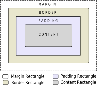
The four concentric rectangles appear conceptually as below:

- The margin falls outside the border.
- The border is drawn between the margin and the padding.
- The padding falls inside the border, between the border and the actual contents.
- The content is what is left from the original widget or subcontrol once we have removed the margin, the border, and the padding.
The margin, border-width, and padding properties all default to zero. In that case, all four rectangles (margin, border, padding, and content) coincide exactly.
You can specify a background for the widget using the background-image property. By default, the background-image is drawn only for the area inside the border. This can be changed using the background-clip property. You can use background-repeat and background-origin to control the repetition and origin of the background image.
A background-image does not scale with the size of the widget. To provide a "skin" or background that scales along with the widget size, one must use border-image. Since the border-image property provides an alternate background, it is not required to specify a background-image when border-image is specified. In the case, when both of them are specified, the border-image draws over the background-image.
In addition, the image property may be used to draw an image over the border-image. The image specified does not tile or stretch and when its size does not match the size of the widget, its alignment is specified using the image-position property. Unlike background-image and border-image, one may specify a SVG in the image property, in which case the image is scaled automatically according to the widget size.
The steps to render a rule are as follows:
- Set clip for entire rendering operation (border-radius)
- Draw the background (background-image)
- Draw the border (border-image, border)
- Draw overlay image (image)
Sub-controls
A widget is considered as a heirarchy (tree) of subcontrols drawn on top of each other. For example, the QComboBox draws the drop-down sub-control followed by the down-arrow sub-control. A QComboBox is thus rendered as follows:
- Render the QComboBox { } rule
- Render the QComboBox::drop-down { } rule
- Render the QComboBox::down-arrow { } rule
Sub-controls share a parent-child relationship. In the case of QComboBox, the parent of down-arrow is the drop-down and the parent of drop-down is the widget itself. Sub-controls are positioned within their parent using the subcontrol-position and subcontrol-origin properties.
Once positioned, sub-controls can be styled using the the box model.
Note: With complex widgets such as QComboBox and QScrollBar, if one property or sub-control is customized, all the other properties or sub-controls must be customized as well.
[Previous: Qt Designer Integration]
[Contents]
[Next: Qt Style Sheets Reference]


